
NOCAFF - Coffee Branding
Nocaff is a decaf canned coffee brand designed to offer the full ritual of coffee without the caffeine. The goal was to create a brand that feels bold yet calm, modern yet approachable, appealing to consumers who want balance without compromise.
This project focused on building a complete brand system, spanning logo design, product packaging, and social advertising.
Defining the Direction
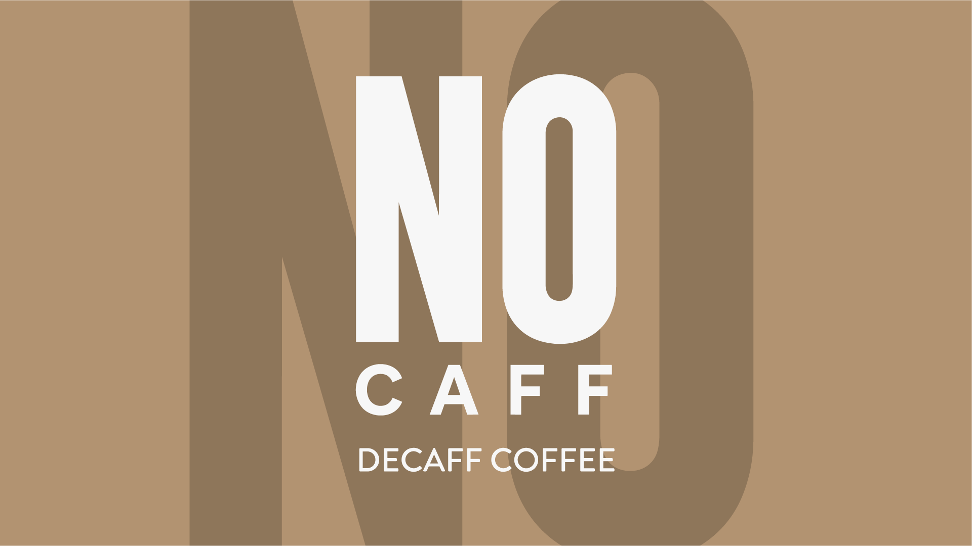
The logo was designed to be simple, confident, and highly legible. A bold, geometric wordmark creates strong presence, with the emphasis on “NO” reinforcing the core idea of removing caffeine. The clean sans-serif typography keeps the brand modern and accessible, ensuring it works seamlessly across packaging, social media, and wider brand applications. The result is a mark that is both distinctive and versatile, forming a strong foundation for the rest of the identity.
The Products
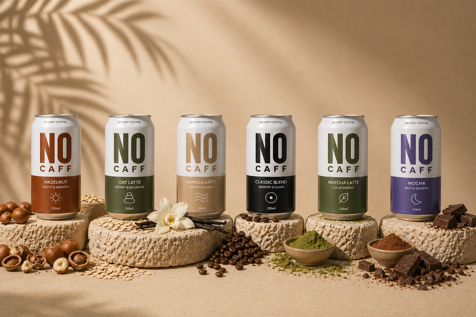
The packaging was developed as a structured system rather than a collection of individual designs. Each can follows the same layout, with a clean white upper section for brand clarity and a colour-coded lower half to differentiate flavours. This allows each product to feel unique while still clearly belonging to the same range. The colour palette was carefully considered to reflect each flavour’s character, warm browns for hazelnut, soft neutrals for vanilla, deep greens for matcha, and darker tones for classic blends, creating both visual variety and cohesion.
Refinement & Application
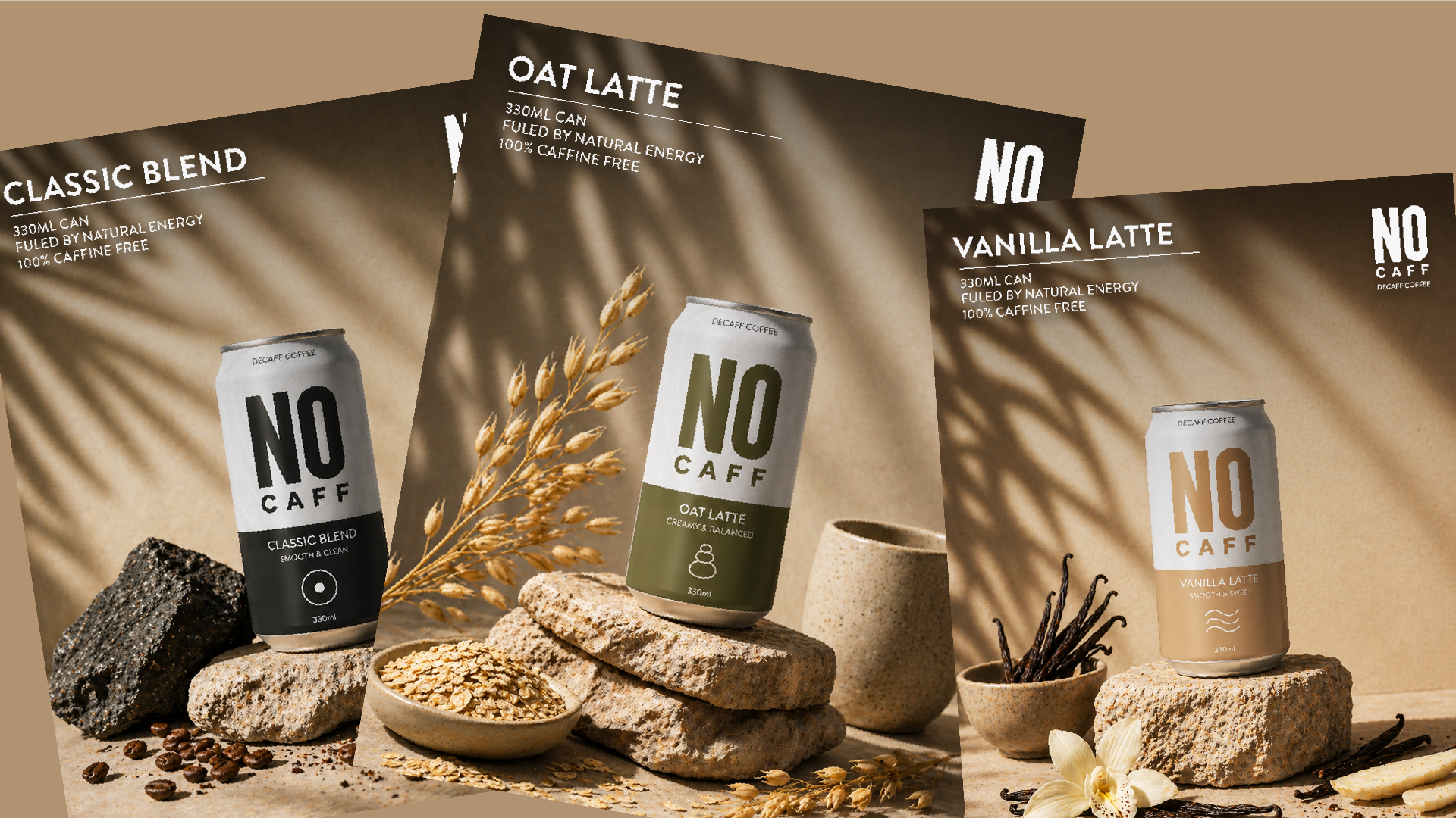
A key part of the project was establishing a consistent visual direction for product photography and advertising. All imagery was built around a controlled studio setup using neutral beige environments, stone pedestals, and soft natural shadows. Ingredients were introduced in a minimal and intentional way to support each flavour without overwhelming the composition. By keeping the camera angle, lighting, and layout consistent, the visuals feel like part of a unified campaign rather than separate executions.
The social advertising system was designed to be clean, high-impact, and instantly recognisable. Each advert focuses on a single product, using the same composition rules while allowing ingredients and subtle colour cues to differentiate each flavour. This approach ensures the content works both individually and as a cohesive series, creating a strong presence across social platforms and reinforcing brand recognition over time.