
LUE - Branding & Packaging
Lue is a conceptual collagen supplement brand designed to bridge the gap between wellness and beauty. The project explores how ingestible supplements can be repositioned as part of a modern, aesthetic beauty routine rather than a clinical or functional product.
The aim was to create a brand that feels soft, minimal, and essential, something that belongs on display, not hidden away.
Defining the Direction
The challenge centred around shifting perception. The supplement industry is often defined by either overly clinical branding or overly saturated wellness aesthetics, creating a disconnect between function and lifestyle. Lue was designed to challenge this by reframing supplements as part of a daily ritual, while also building a cohesive system across multiple products rather than focusing on a single SKU. The goal was to balance premium aesthetics with clarity, ensuring the brand feels both aspirational and usable.
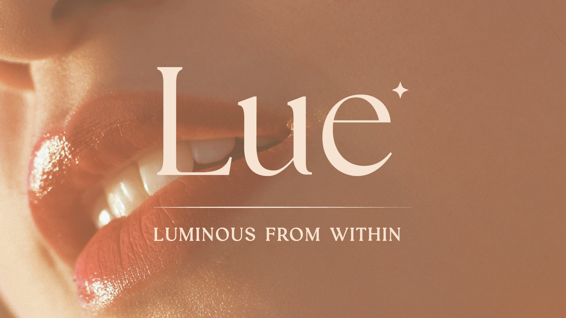
The approach was built around the idea of “luminous simplicity.” This meant creating a design language that feels calm, refined, and effortless. A minimal serif wordmark was used to establish a premium yet approachable identity, supported by a muted, desaturated colour palette inspired by natural skin tones and soft materials. Subtle gradient accents were introduced to represent hydration and glow, while spacious layouts ensured the products remained the focus. Every decision was guided by restraint, allowing the brand to feel considered rather than over-designed.
The Products
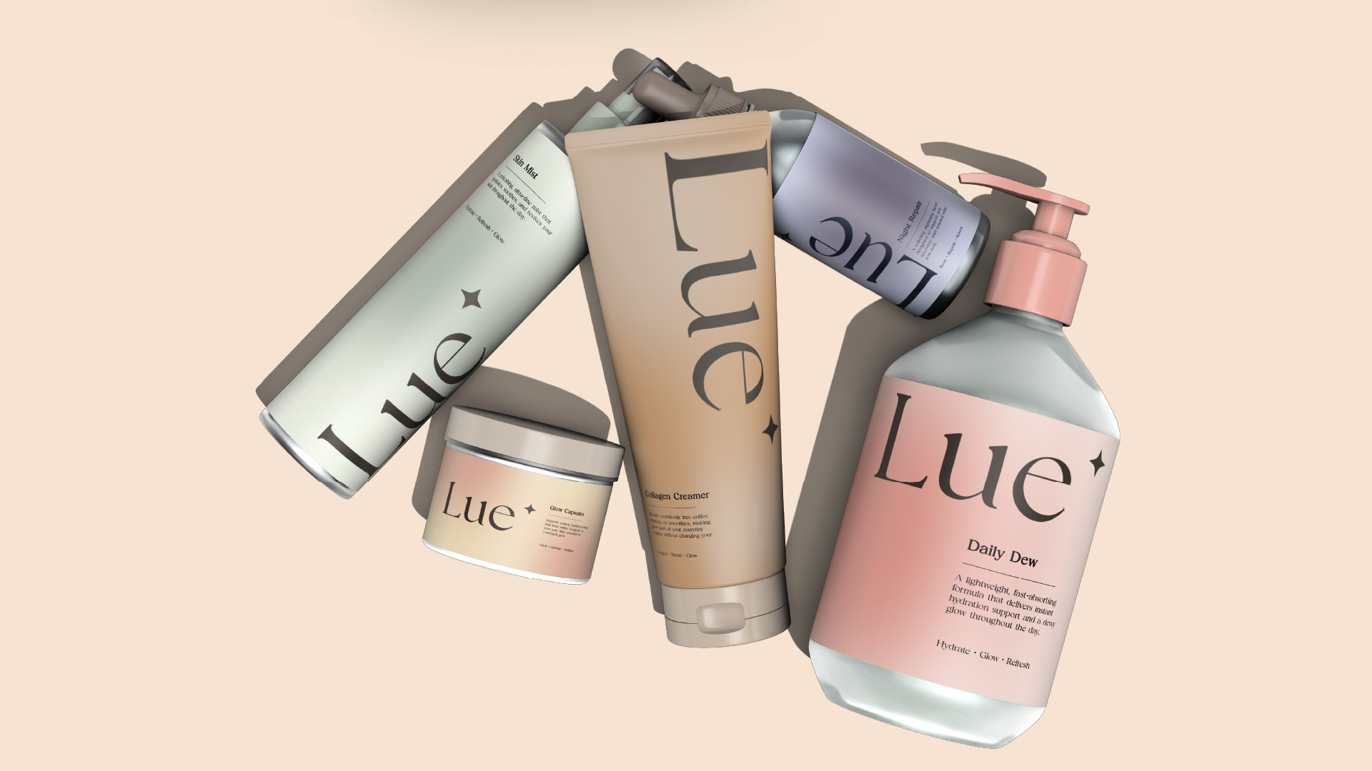
Rather than developing a single product, Lue was expanded into a complete system to reinforce the idea of beauty as a routine. The range includes Glow Capsules as the core daily supplement, Daily Dew for hydration, Collagen Creamer to integrate into everyday habits, Night Repair for evening use, Skin Mist as a topical extension, and Beauty Gummies as a more lifestyle-driven format. Each product plays a role within a wider daily flow, creating a connected and intentional experience.
The packaging was designed to feel cohesive, tactile, and quietly distinctive. Neutral base tones unify the range, while soft gradient accents subtly differentiate each product without disrupting the overall system. Typography is kept minimal and structured to maintain clarity, and the material direction leans toward matte and frosted finishes to enhance the premium feel. The result is a collection that feels curated and balanced, with a strong emphasis on simplicity and consistency.
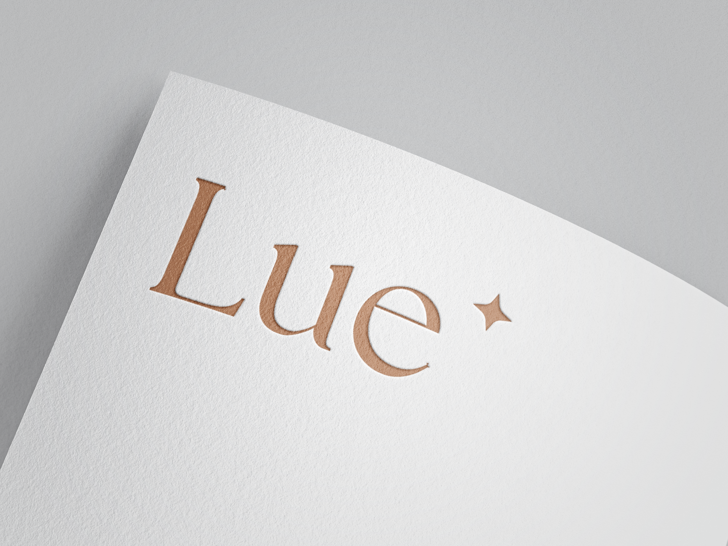
Logo Refinement & Application
Art direction for the project draws from editorial beauty campaigns, focusing on natural light, soft textures, and close-up skin details. Imagery was selected to reinforce the idea of glow and hydration, while maintaining a minimal and modern aesthetic. Compositions were kept clean with intentional use of negative space, ensuring the brand feels elevated and aligned with contemporary beauty standards.
Lue demonstrates how thoughtful design can transform perception within a category. By combining strategic positioning with a cohesive visual system, the project reimagines supplements as a desirable, lifestyle-driven product. It highlights the value of consistency, restraint, and clarity in building a brand that feels both modern and commercially relevant.