
YUMM - Artisan Cookie Branding
YUMM is a modern cookie bakery concept designed to sit at the intersection of indulgence, gifting culture, and street-inspired branding. The goal of the project was to create a brand that feels instantly craveable and shareable, something that works just as well on Instagram as it does on premium packaging. The positioning focused on soft, buttery cookies presented as a treat-worthy experience, blending playful energy with a refined, scalable identity.

Defining the Direction
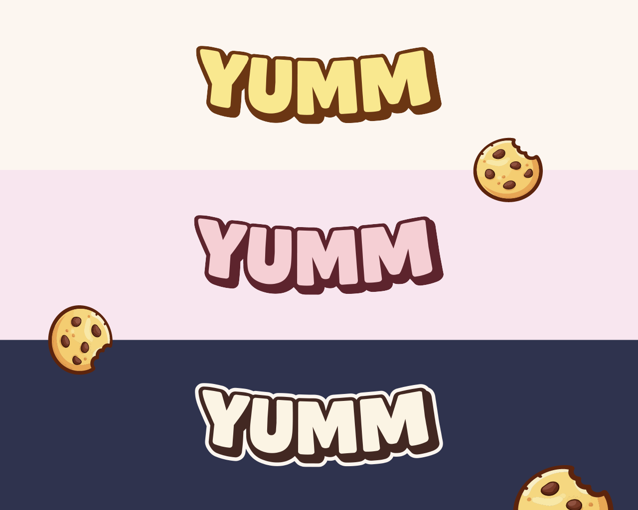
At the core of the identity is a custom wordmark built around the idea of a “smile.” Instead of relying on an added graphic element, the typography itself curves upward, subtly mimicking the shape of a smile. This approach keeps the logo clean and ownable while embedding emotion directly into the form. The letterforms were designed to feel soft and rounded, echoing the texture of cookies, while maintaining enough structure to scale across signage, packaging, and digital use. Special attention was given to consistency, particularly ensuring both “M” characters match perfectly and that the outline weight remains uniform across all letters.
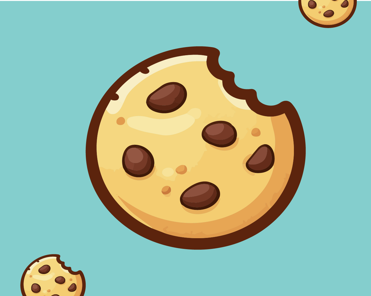
Alongside the wordmark, a secondary cookie icon was developed to support the brand system. The icon features a simplified chocolate chip cookie with a bite taken out, reinforcing the indulgent and slightly playful tone of the brand. The lines were intentionally refined into clean, vector-friendly shapes to ensure the icon can be easily reproduced, traced, and applied across different mediums, from stickers and social avatars to embossed packaging seals.
Further Development
The colour palette draws from warm, appetising tones inspired by baked goods. Golden yellows and soft caramel hues form the foundation, supported by rich chocolate browns and neutral creams. These colours were chosen to evoke warmth and indulgence while still feeling contemporary and bold. Additional exploratory palettes, including pinks, oranges, greens, and darker tones, demonstrate the flexibility of the identity, allowing the brand to adapt across seasonal campaigns or product drops without losing recognition.
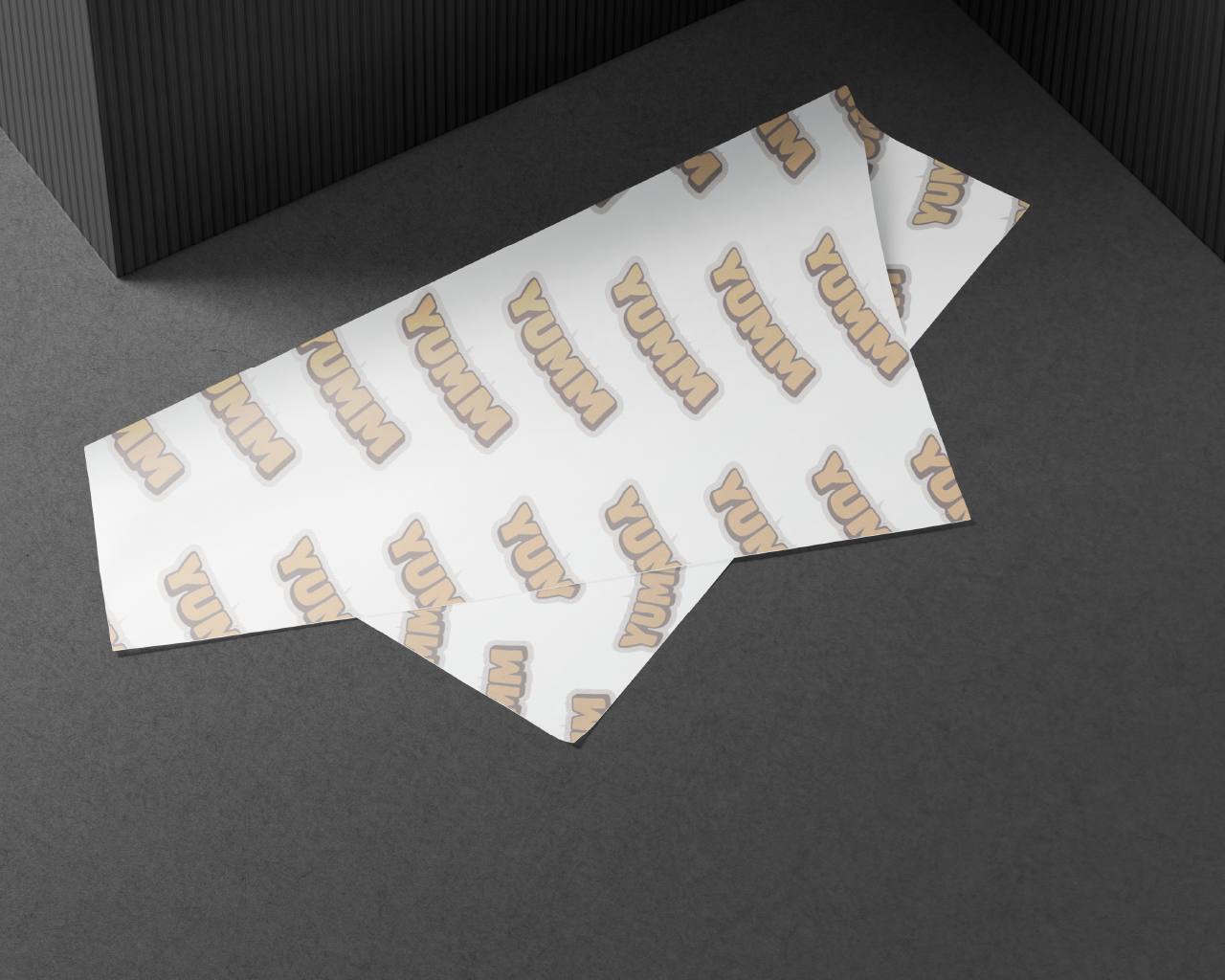
Application was a key part of the design process. The identity was extended into packaging concepts, including tissue paper, boxes, and gift wraps.
The curved wordmark lends itself particularly well to repetition, creating strong patterns that feel dynamic and premium. The cookie icon works as a seal or badge, reinforcing the gifting aspect of the brand. Together, these elements create a cohesive system that elevates even simple packaging into something memorable and shareable.
Refinement & Application
Overall, YUMM is designed as a brand that balances clarity with personality. By focusing on a strong, distinctive wordmark and supporting it with a flexible visual system, the identity avoids over-reliance on gimmicks while still feeling expressive and fun. The result is a brand that can scale, from a single bakery to a recognisable, lifestyle-driven product, while maintaining a clear and consistent visual language.