Priory Kitchen
Category: Branding, Sector: Hospitality
Priory Kitchen is a local café and food service brand developed with a focus on clarity, accessibility, and functionality. The brand needed a simple yet professional identity that could be applied across menus, signage, and promotional materials, creating a consistent experience for customers at every touchpoint.
The logo is designed around a bold, circular badge featuring a plate and cutlery icon, immediately communicating food service in a clear and universal way. Set in a modern sans-serif typeface, the brand name is split across two lines to maintain balance within the roundel, ensuring easy readability even at smaller sizes or from a distance.
A monochrome colour palette was chosen to maintain a clean and neutral aesthetic, while also being cost-effective for large-scale printing. This minimalist approach reflects the café’s values, straightforward service, quality food, and no unnecessary complexity.
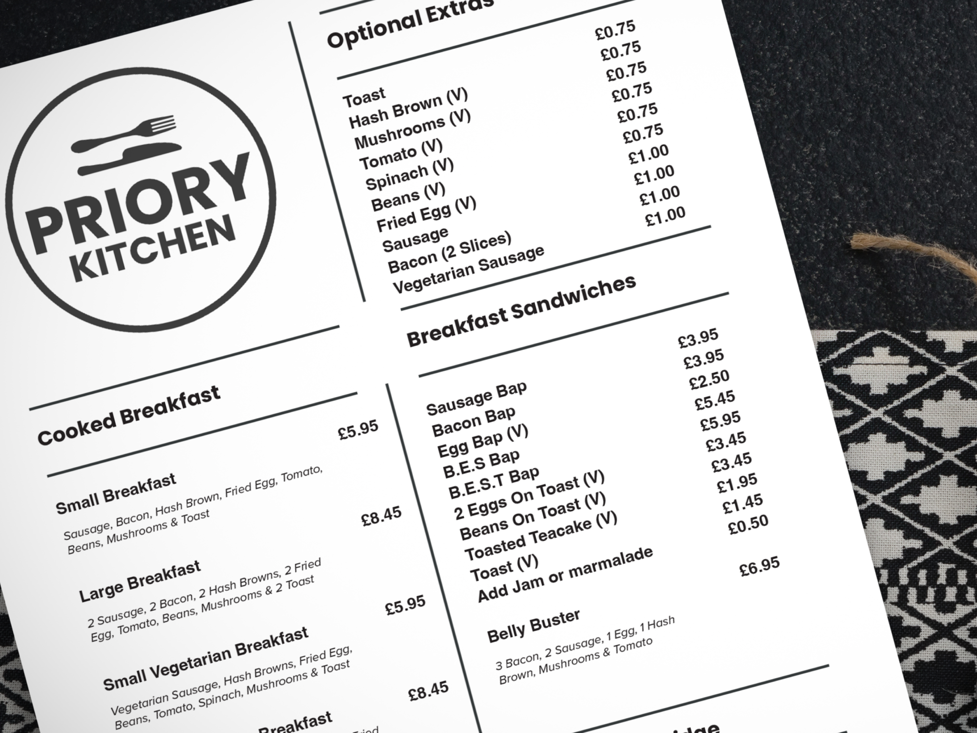
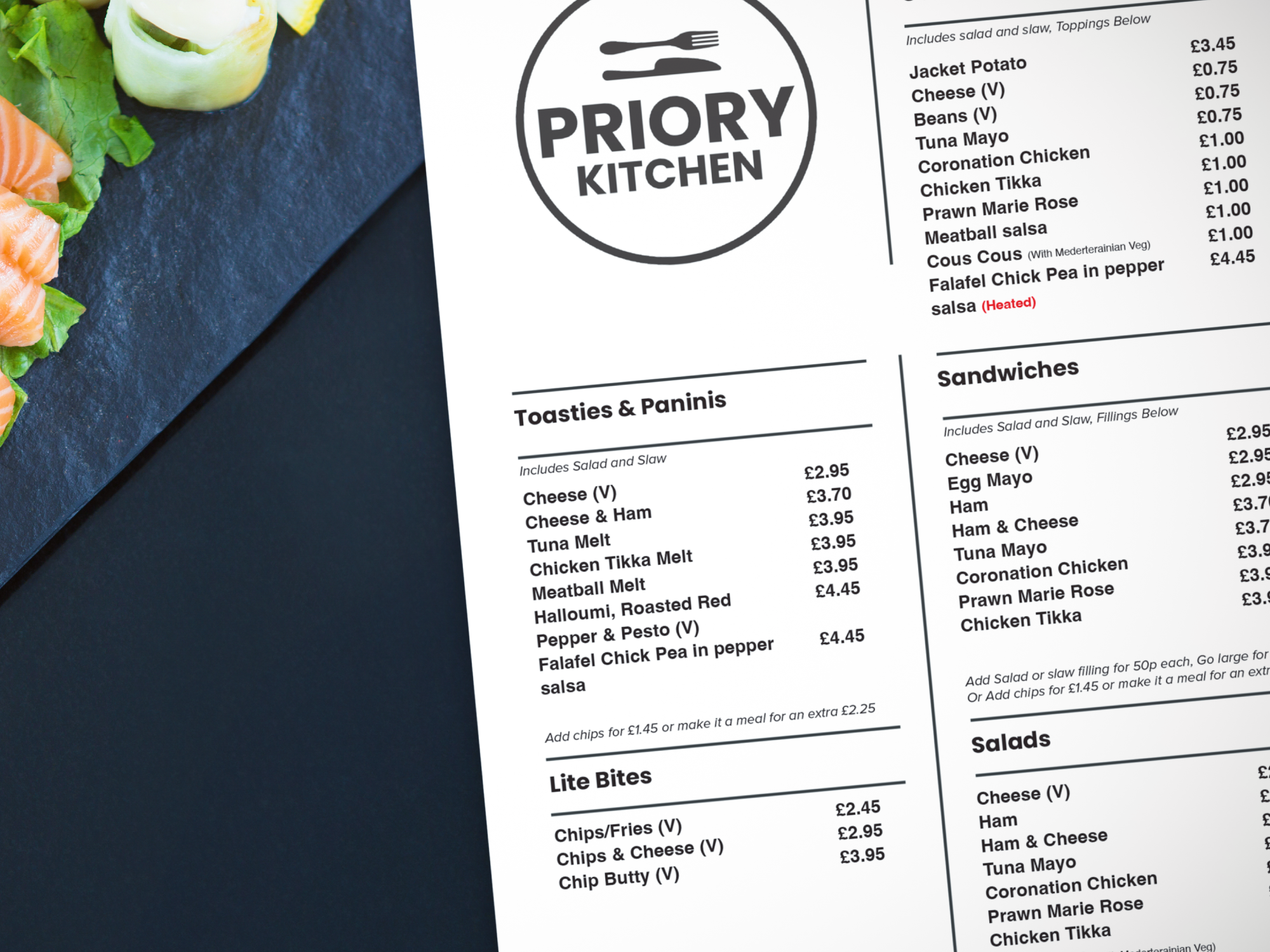
The Menu design became a central focus of the project. I implemented a structured grid system with a clear visual hierarchy to guide customers smoothly through the menu and help them find items quickly and intuitively. Particular attention was paid to typography and spacing, ensuring that information remained legible, balanced, and easy to absorb at a glance.
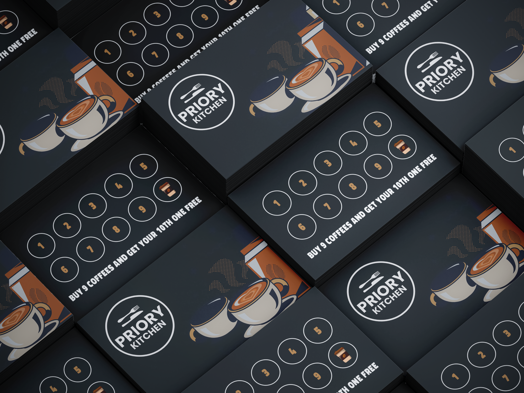
As part of the supporting brand assets, I developed custom loyalty cards to support customer retention and repeat engagement. The cards were designed in line with the established brand system, applying consistent colour palettes, typography, and graphic elements to ensure visual cohesion across touch points.
Consideration was given to layout, print finishes, and durability, resulting in a tactile asset that not only reinforces brand recognition but also enhances the overall user experience. Functionally, the cards serve as a clear and intuitive loyalty mechanism, strengthening the brand–customer relationship through repeated interaction.