VYRE Fitness
Category: Branding
VYRE is a conceptual fitness brand developed to explore how a performance-led identity can feel modern and disciplined without relying on the visual clichés common within the industry. The objective was to create a brand that communicates progression, control, and strength through design rather than through exaggerated messaging or aggressive styling.
Defining the Direction
One of the primary challenges was differentiation. The fitness market is saturated with bold typography, loud colour palettes, and overused motivational language. To avoid blending into this landscape, the project required a more restrained and strategic approach. The identity needed to feel powerful yet minimal, premium yet accessible, and versatile enough to function across apparel, digital platforms, and physical environments.
Development
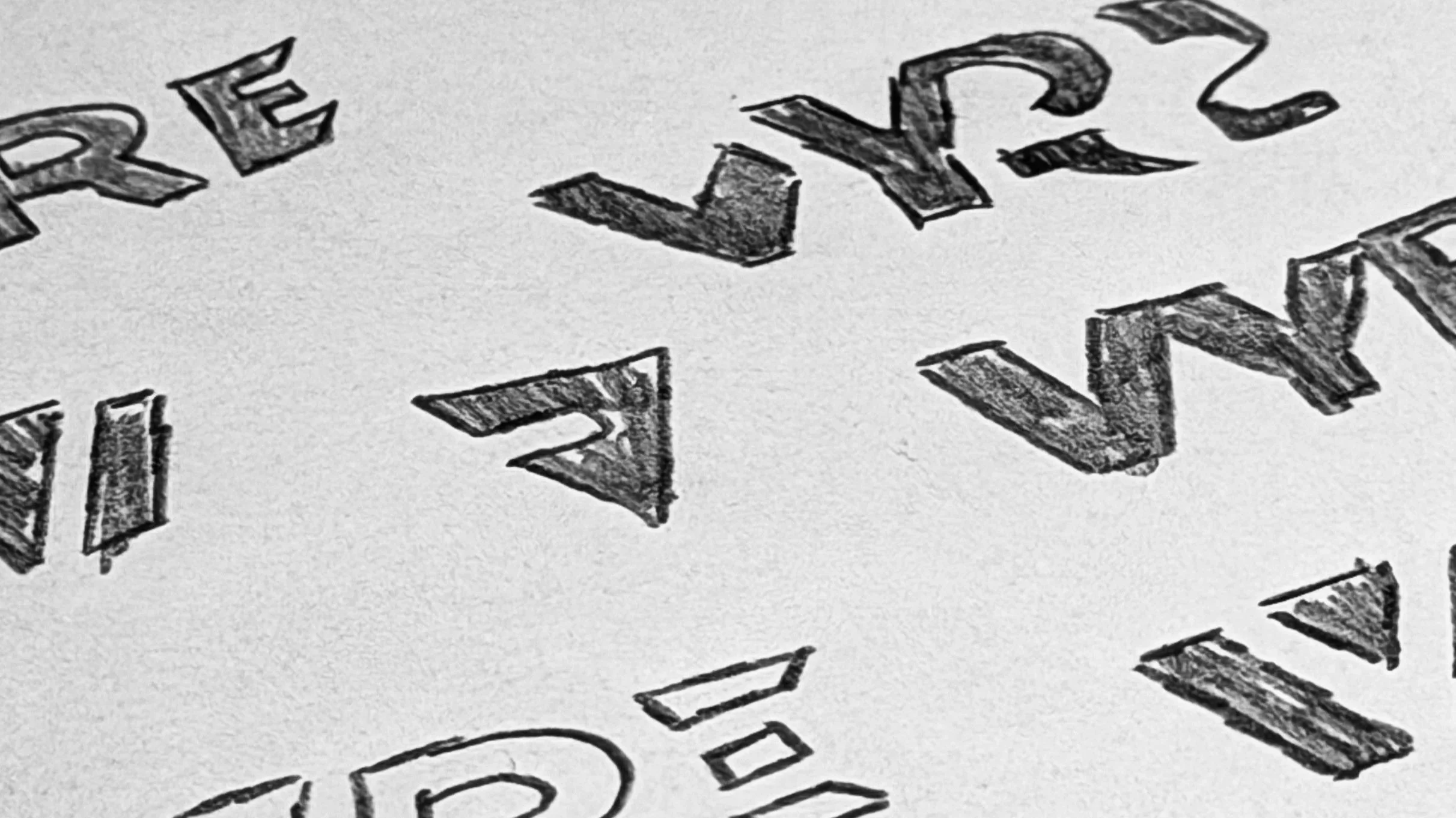
The process began with extensive sketch exploration, focusing on geometric letterforms and controlled negative space to convey motion and intensity in a subtle way. By iterating through multiple wordmark variations, I tested balance, legibility, and scalability before refining the strongest direction. Particular attention was given to proportion and angular detailing to introduce tension without compromising clarity.
Logo Refinement & Application
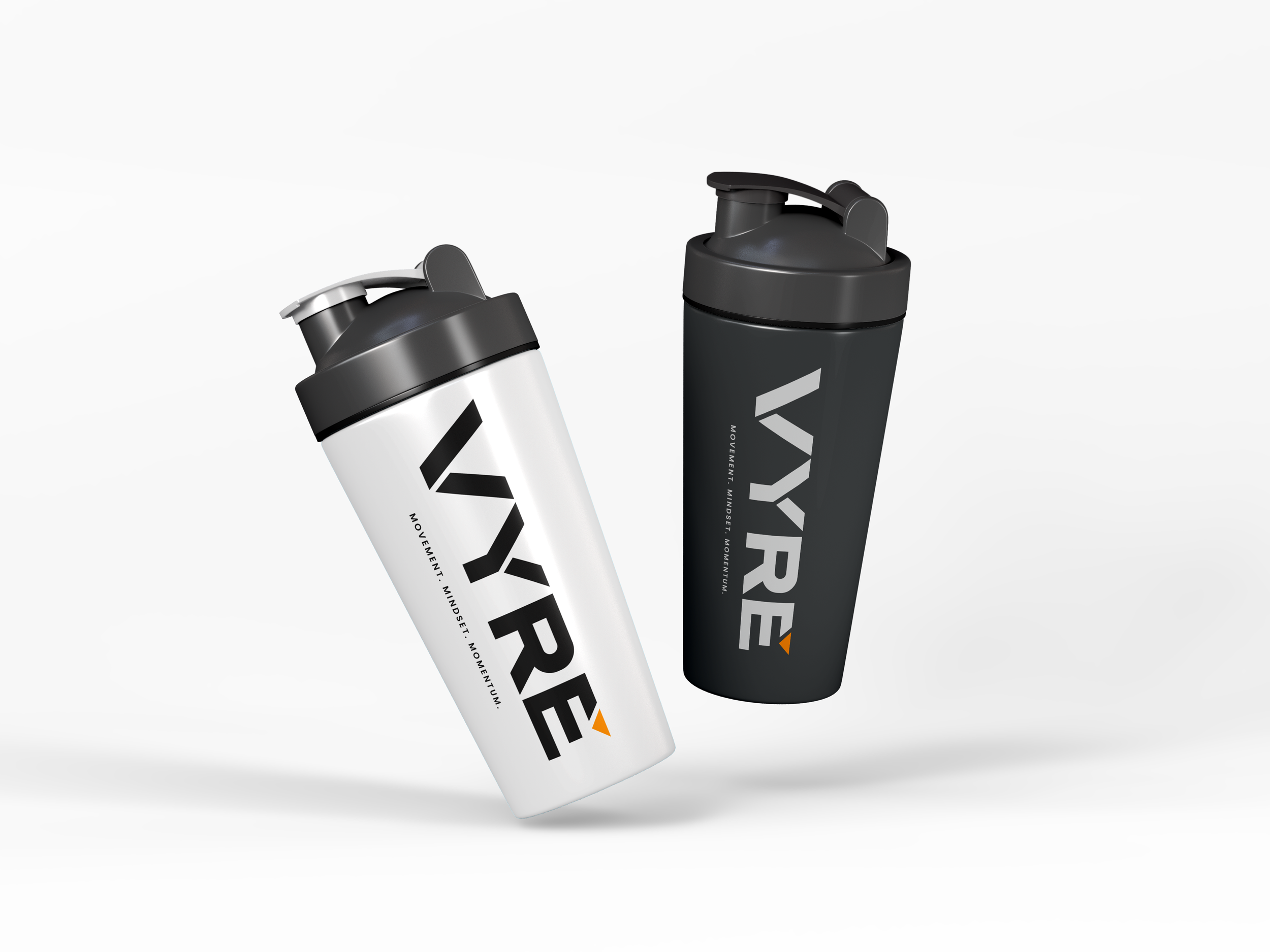
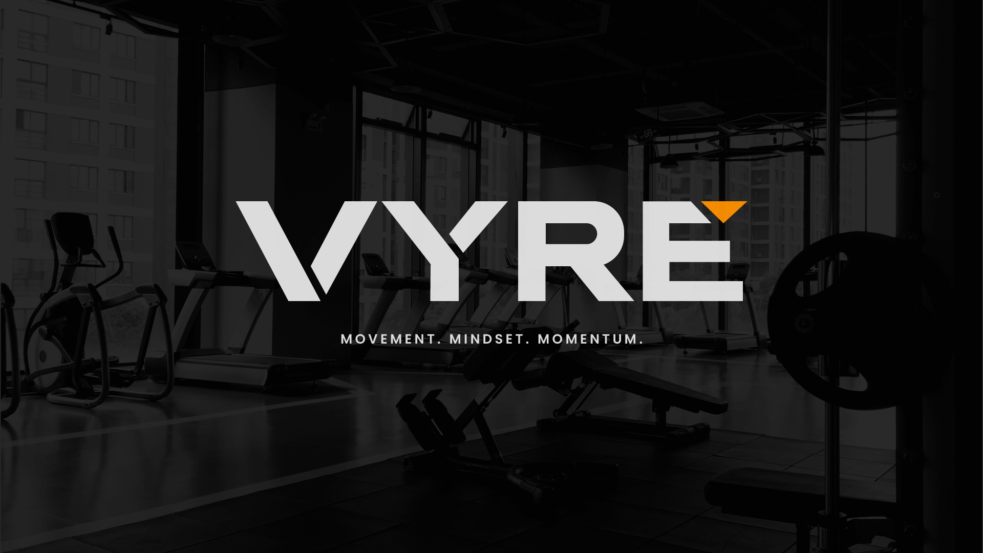
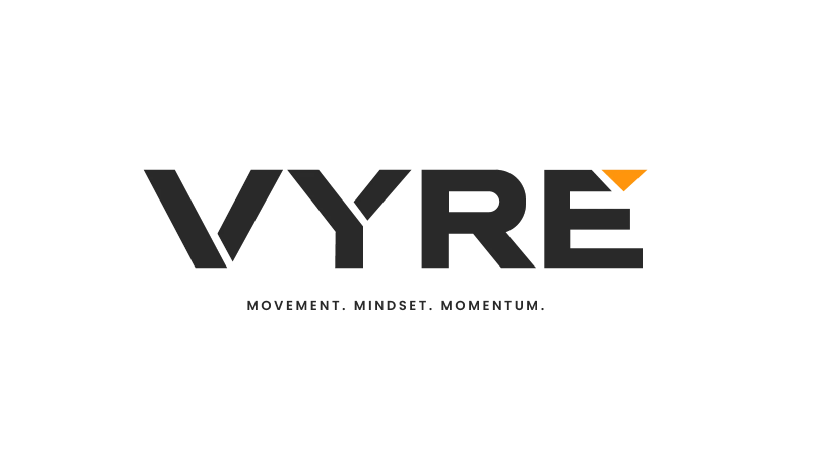
The final solution centres around a custom geometric wordmark supported by a monochrome visual system. The identity was then applied across realistic brand touchpoints, including performance apparel, accessories, gym environments, and digital interfaces, ensuring consistency and scalability. VYRE demonstrates my ability to approach branding strategically, solve differentiation challenges through considered design decisions, and build a cohesive identity system ready for real-world application.