Elite Energy
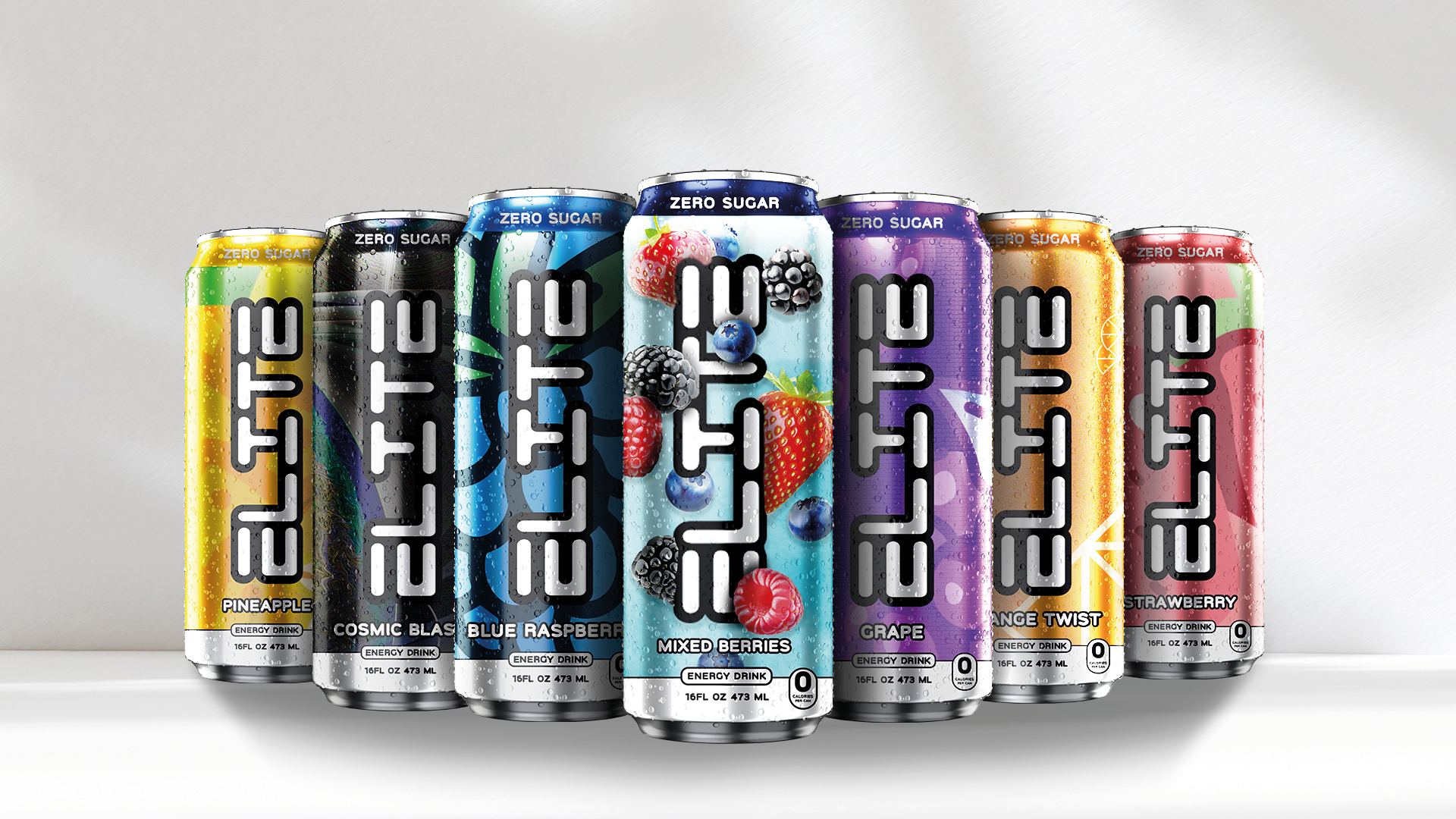
Elite Energy is a sleek and minimal energy drink brand designed specifically for the modern gamer. The project explores the intersection of clean visual design and high-impact branding, delivering a range of flavoured drinks that stand out on shelves while resonating with a tech-savvy, competitive audience.
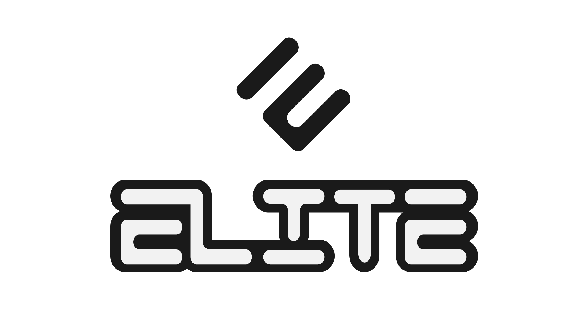
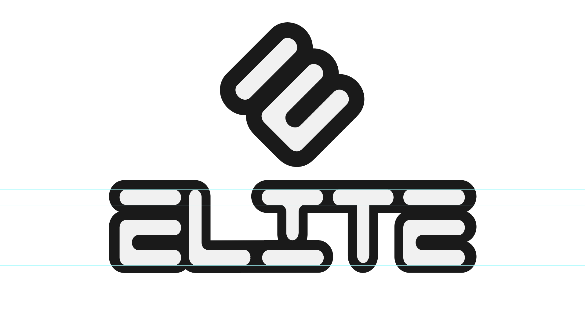
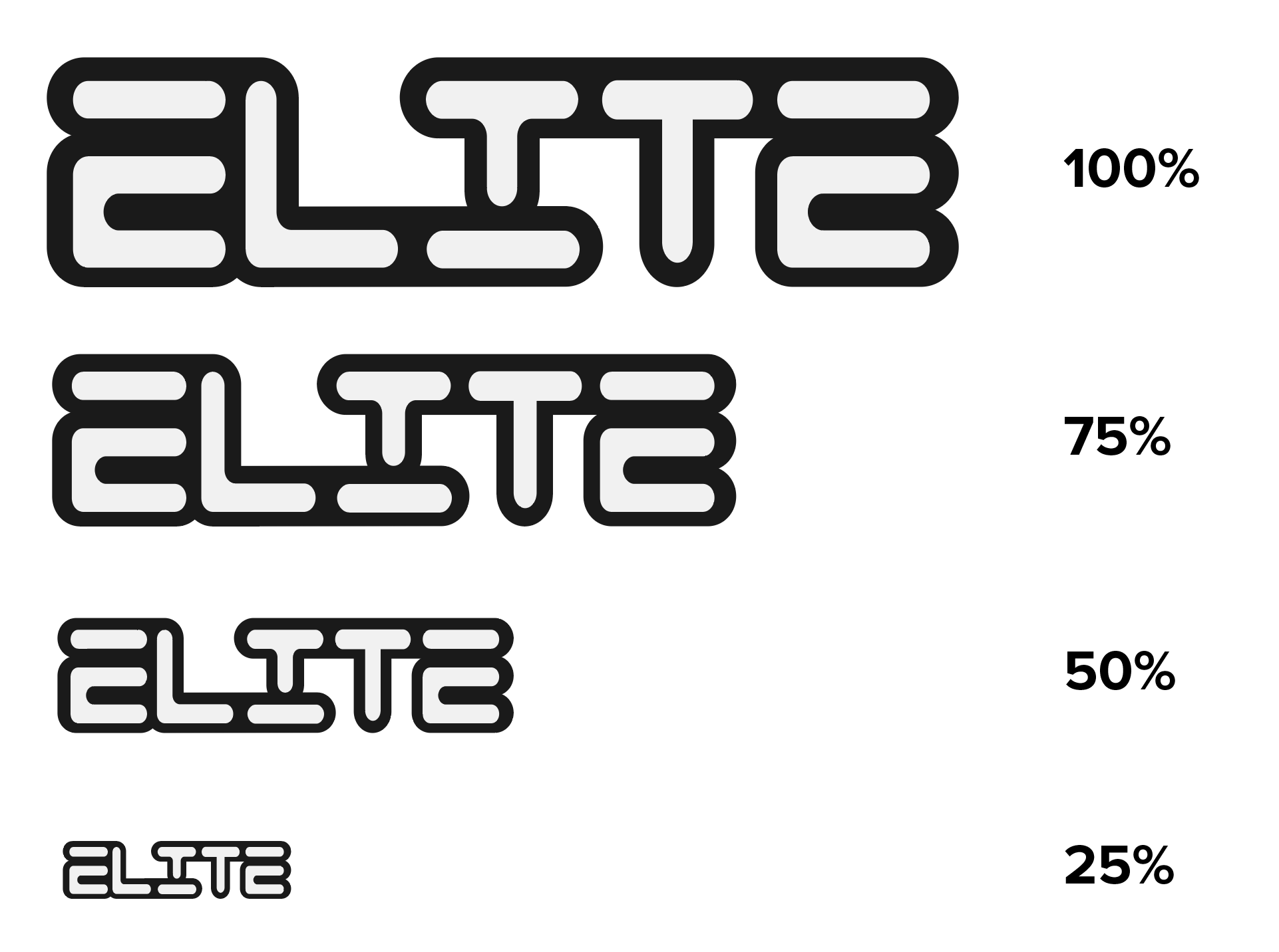
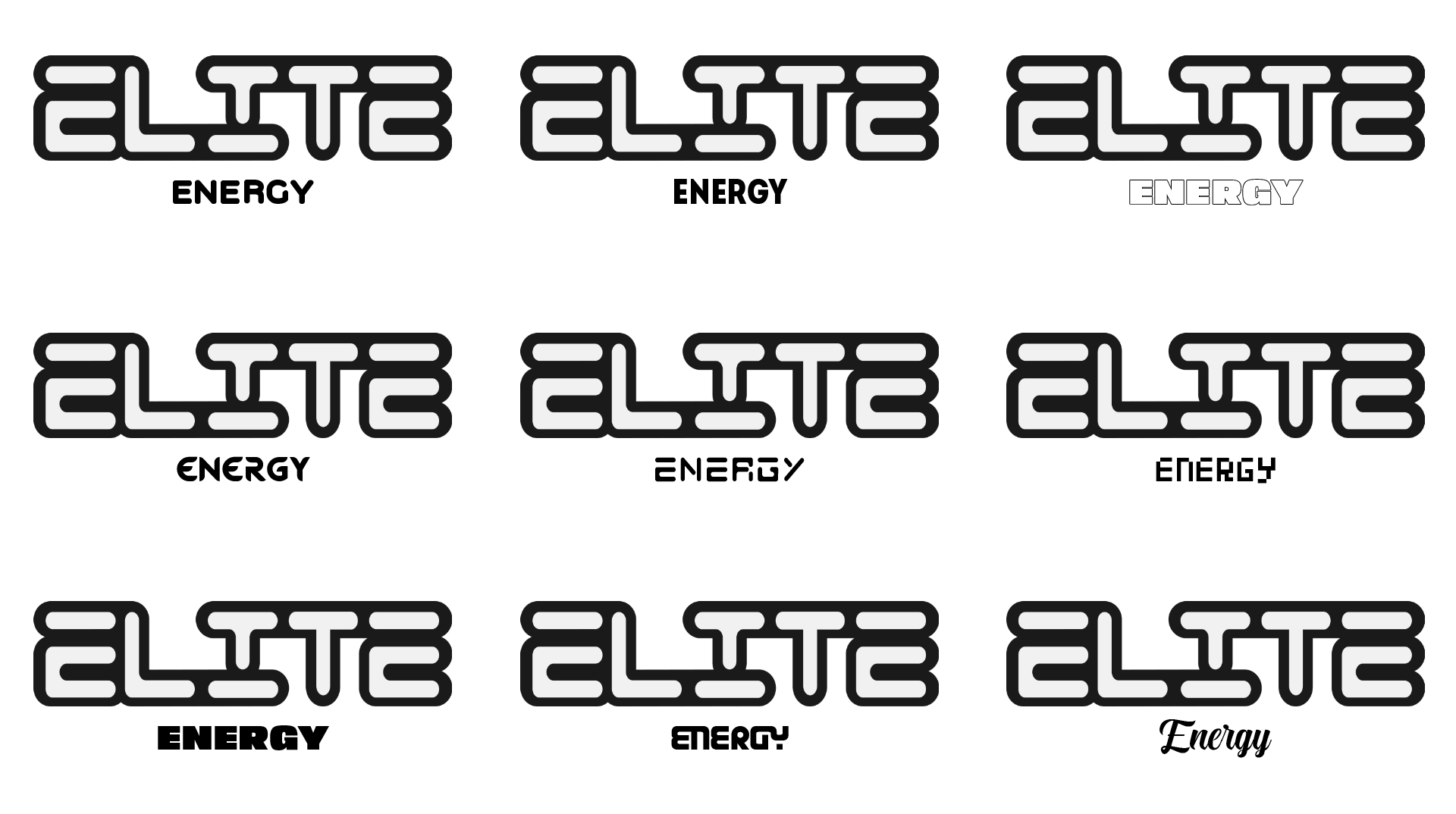
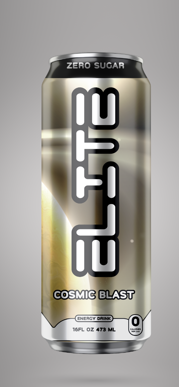
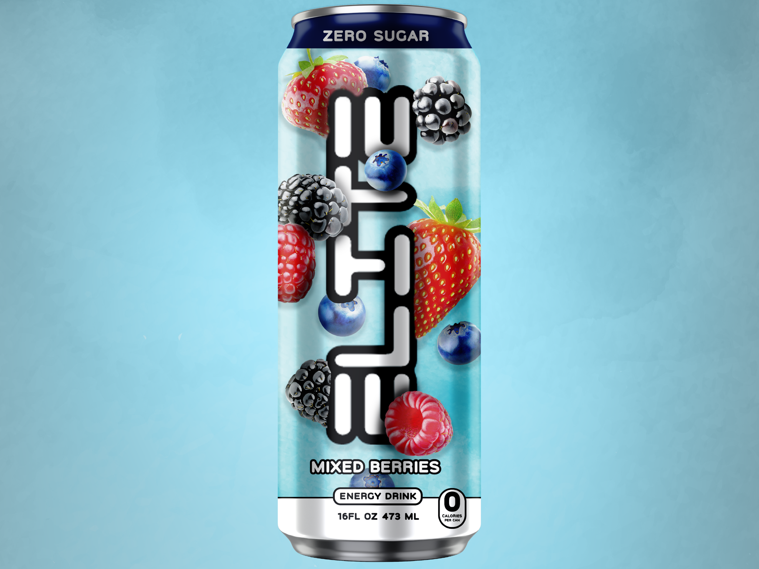
This concept required the development of a custom typeface to reflect the futuristic and digital-first identity of the brand. The type design is bold, geometric, and modular, mirroring elements of gaming culture, HUD interfaces, and pixel structure. It was carefully crafted to feel both clean and aggressive, making it ideal for the vertical logotype used across each can.
By combining a unique typographic identity with a sharp, minimalist design approach, Elite Energy positions itself as a focused, premium option in a saturated market, crafted for gamers who demand clarity, performance, and style. This project offered the opportunity to experiment with product design, typography, and branding as one cohesive system, pushing the boundaries of what a functional energy drink brand for a niche audience could look like.
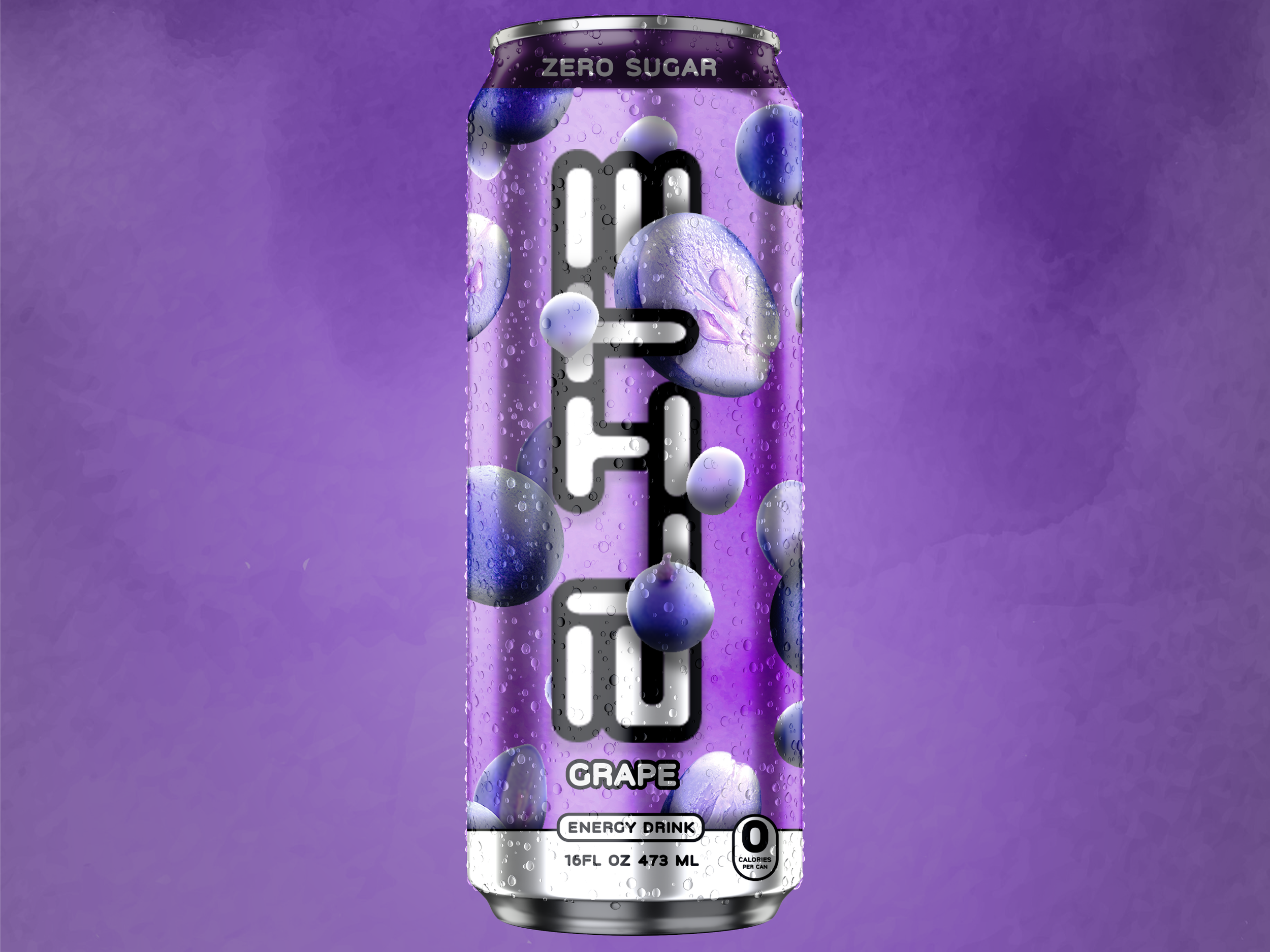
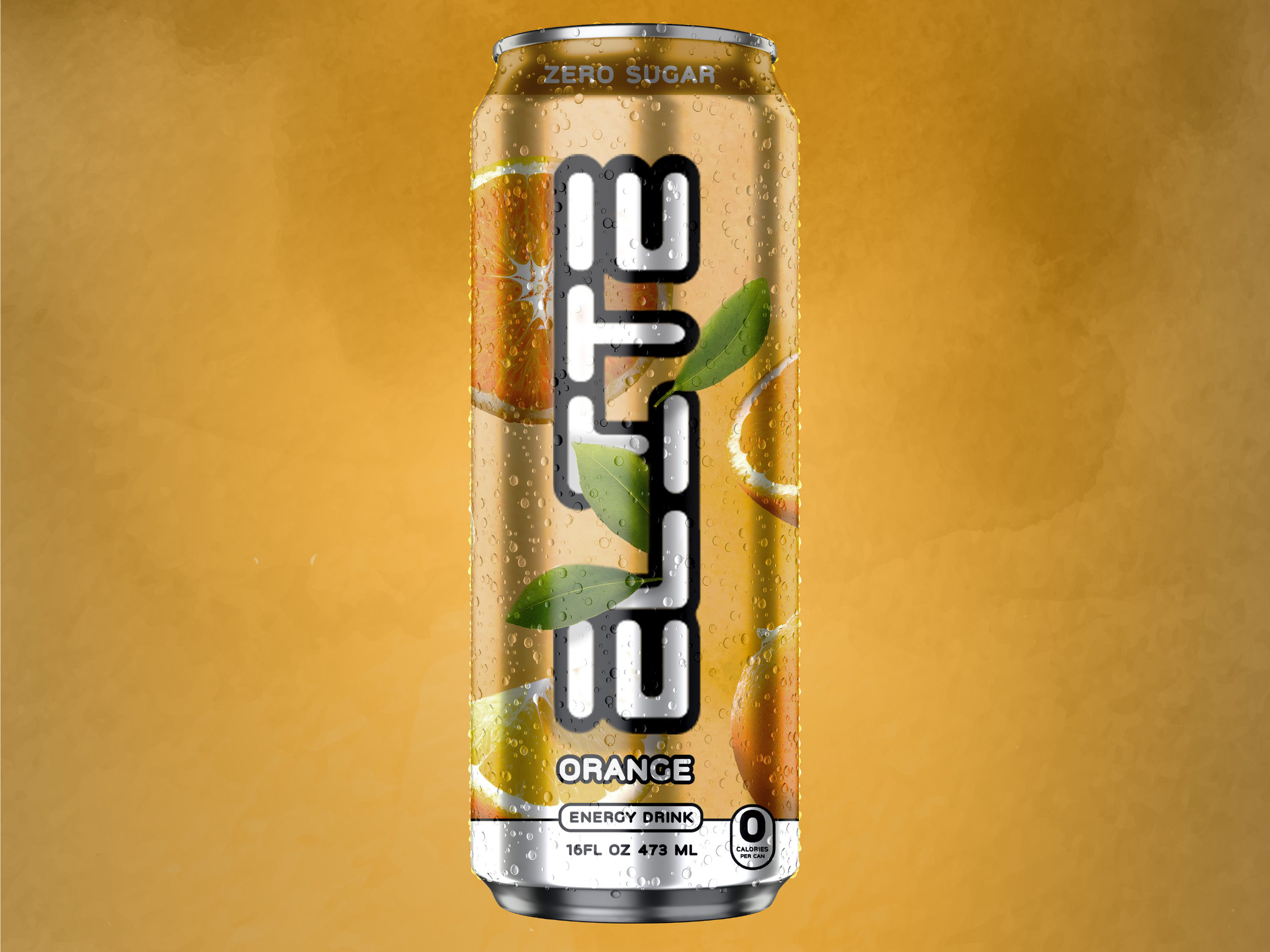
The product line features bold flavour names such as Mixed Berries, Cosmic Blast, Grape, and Orange Twist, each with a vibrant colour scheme and minimal design. The clean background textures and fruit graphics create visual interest while maintaining brand consistency across the lineup. All cans include clearly labelled nutritional info, a strong zero-sugar callout, and a unified layout system for seamless shelf presence.